Have you ever stood in front of your wardrobe, holding a shirt in one hand and trousers in the other, unsure whether they go together? Choosing colours is one of the most common style struggles. Some people play it safe with black, white and grey. Others buy colourful clothes but feel nervous about wearing them.
The good news is that colour matching is not random. Designers, artists and stylists rely on a simple tool called the colour wheel to understand which colours work well together. Once you learn the basics, you can create attractive outfits with confidence and even use bold colours without fear.
In this guide, we explain the colour wheel in plain language, show how each colour scheme works with real outfit ideas and share tips to avoid common mistakes. You do not need any art background to follow along.
What Is the Colour Wheel?
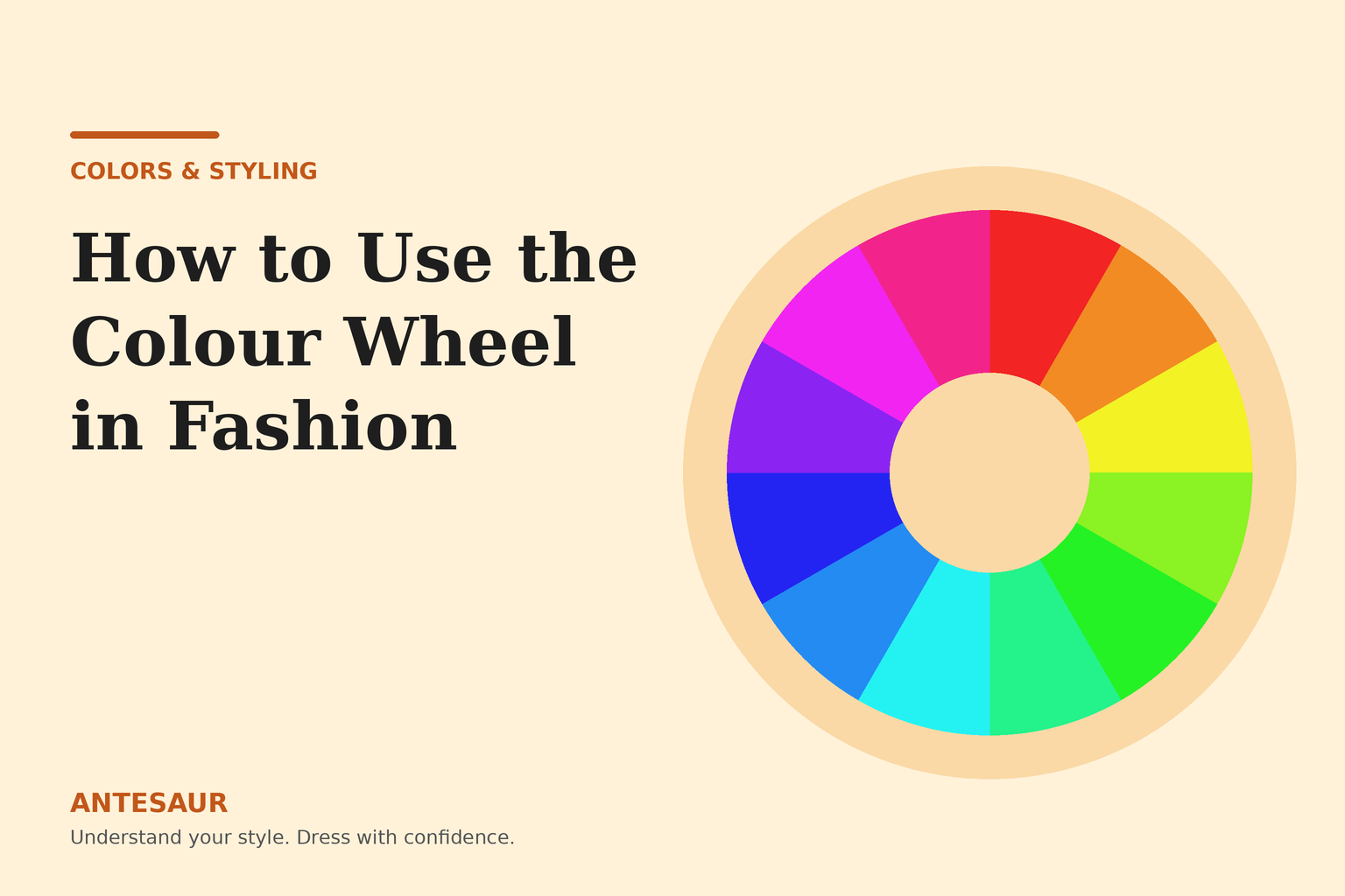
The colour wheel is a circle that shows how colours relate to each other. It is usually divided into three groups.
Primary Colours
Red, blue and yellow. These are the base colours that cannot be created by mixing other colours.
Secondary Colours
Orange, green and purple. These are made by mixing two primary colours. For example, red and yellow make orange.
Tertiary Colours
Colours such as red-orange, yellow-green and blue-violet. These are made by mixing a primary and a secondary colour. They give the wheel its full range.
When you look at the wheel, colours that sit near each other feel similar and calm. Colours on opposite sides create strong contrast and energy. That simple idea is the foundation of colour matching.
Three Words You Need to Know: Hue, Tint and Shade
Before using the wheel, it helps to understand how colours can change.
- Hue: The pure colour itself, such as red, blue or green.
- Tint: The hue mixed with white, making it lighter. Pink is a tint of red.
- Shade: The hue mixed with black, making it darker. Maroon is a shade of red.
- Tone: The hue mixed with grey, making it softer or more muted. Dusty rose is a tone of red.
In fashion, tints, shades and tones are everywhere. Navy is a shade of blue, sky blue is a tint and slate blue is a tone. This matters because the same colour family can look bold, soft or sophisticated depending on how light or muted it is.
Warm and Cool Colours
The wheel can also be divided into warm and cool halves.
- Warm colours: Red, orange, yellow and colours in between. They feel energetic, friendly and bright.
- Cool colours: Blue, green and purple. They feel calm, fresh and professional.
Mixing warm and cool colours can create interesting contrast, while staying within one temperature creates harmony. Knowing this helps you control the mood of your outfit.
The Main Colour Schemes for Outfits
Here are the most useful colour combinations from the wheel, explained with fashion examples.
1. Monochromatic
A monochromatic outfit uses different shades, tints and tones of one colour.
How it works: Because everything comes from the same colour family, the look is smooth, elegant and easy to coordinate.
Examples:
- Light blue shirt with navy trousers
- Cream top with beige trousers and a camel coat
- Olive tee with dark green cargo pants
Tips: Add texture to avoid a flat look. For example, mix cotton, denim and knit. Also vary the lightness so that every piece is not exactly the same shade.
Best for: People who want a clean, polished look without effort. It also makes you look taller and slimmer through a continuous colour line.
2. Analogous
Analogous colours sit next to each other on the wheel, such as blue, blue-green and green, or red, red-orange and orange.
How it works: These colours feel natural and harmonious because they share common undertones.
Examples:
- Teal shirt with olive trousers
- Mustard top with orange-brown jacket
- Purple kurta with blue jeans
Tips: Choose one dominant colour, one supporting colour and use the third as a small accent.
Best for: Soft, easy colour combinations that look intentional but not loud.
3. Complementary
Complementary colours sit opposite each other on the wheel, such as blue and orange, red and green or yellow and purple.
How it works: Opposites create strong contrast, so each colour looks brighter next to the other.
Examples:
- Navy jacket with a rust or orange T-shirt
- Maroon shirt with olive trousers (a muted version of red and green)
- Mustard sweater with purple or plum trousers
Tips: Do not use equal amounts of both colours. Use one as the main colour and the other as an accent. Muted or toned-down versions look more sophisticated than very bright ones.
Best for: People who want to stand out in a controlled, stylish way.
4. Split-Complementary
This scheme uses one main colour and the two colours on either side of its opposite.
How it works: It gives strong contrast like complementary colours but is less intense and easier to wear.
Examples:
- Blue shirt with yellow-orange and red-orange accessories
- Green top with a pink and a burgundy accent
Best for: Confident dressers who want something interesting but not too bold.
5. Triadic
A triadic scheme uses three colours spaced evenly around the wheel, such as red, blue and yellow, or orange, green and purple.
How it works: It is lively and balanced but can easily become too much.
Examples:
- Navy jacket, mustard sweater and a red scarf
- Olive shirt, orange accessories and purple socks
Tips: Use one colour as the main, the second in a smaller amount and the third only as a tiny detail. Use muted tones instead of bright ones.
Best for: Creative outfits, festive occasions and personality-driven looks.
6. Neutral with a Pop of Colour
This is not an official wheel scheme, but it is the easiest to wear. You build the outfit from neutrals such as black, white, grey, beige and navy, then add one colourful piece.
Examples:
- Grey sweater and dark jeans with a red cap
- White shirt and beige trousers with a green belt
- Black outfit with a bright yellow bag
Best for: Beginners and anyone who wants simple, reliable outfits. Read our guide on neutral colours every wardrobe needs to understand how to build this base.
Understanding the 60-30-10 Rule
One of the best ways to balance colours is the 60-30-10 rule.
- 60% dominant colour: Usually your main clothing piece or the largest part of the outfit, such as trousers or a coat.
- 30% secondary colour: A supporting colour, often your top or an inner layer.
- 10% accent colour: A small pop of colour, such as shoes, a scarf, a watch strap or a bag.
For example, imagine an outfit with navy trousers (60%), a light blue shirt (30%) and a tan belt and shoes (10%). The proportions look balanced and attractive.
This rule works well with any colour scheme. It prevents you from over-using bold colours and helps you build outfits that look coordinated.
How to Use the Colour Wheel Step by Step
Follow this simple process each time you want to build an outfit.
- Pick your starting piece. This is usually the item you most want to wear, such as a patterned shirt or coloured jacket.
- Find its position on the wheel. Decide which colour family it belongs to.
- Choose a scheme. Decide whether you want a harmonious look (monochrome or analogous) or a bold look (complementary or triadic).
- Select supporting pieces. Use neutrals for the bulk of the outfit and bring in colour on one or two items.
- Apply the 60-30-10 rule. Check the proportions and adjust.
- Add texture and accessories. Belts, shoes, watches and bags can pull the colours together.
- Check in natural light. Colours look different outdoors and indoors.
Practical Outfit Examples
For Men
- Monochrome: Olive overshirt, dark green tee and khaki trousers with white sneakers.
- Analogous: Teal polo with navy trousers and grey sneakers.
- Complementary: Navy blazer, rust tee and grey trousers.
- Neutral with a pop: Grey sweatshirt, black jeans and a mustard beanie.
For Women
- Monochrome: Cream blouse, beige trousers and a camel jacket.
- Analogous: Lavender kurta with blue jeans and silver accessories.
- Complementary: Mustard top with plum trousers and neutral flats.
- Neutral with a pop: White shirt, black trousers and a bright coral bag.
Using the Colour Wheel with Skin Tone
The colour wheel is a general guide, but your skin tone and undertone also matter. A complementary pair that looks great on one person might not suit another. Once you understand the wheel, test combinations near your face and see how your skin responds. Our full guide on best colours for your skin tone explains how to do this properly.
Using Patterns with Colour
Patterns add another layer to colour matching. A few simple tips can keep things neat.
- Match one colour from the pattern. If a shirt has stripes in blue and white, pair it with plain blue trousers.
- Keep one item plain. If the top is patterned, the bottom should usually be solid.
- Mix patterns carefully. If you combine two patterns, choose different scales, such as thin stripes with a larger check, and keep the colours in the same family.
Colour Matching Ideas for Everyday Wear
If you want ready-made combinations for daily outfits, you can read our guide on best colour combinations for everyday wear. For jeans and tees specifically, our article on how to match T-shirt colours with jeans gives simple pairings you can use immediately.
Common Mistakes When Using the Colour Wheel
- Using too many bright colours at once. Stick to one or two bold colours, and keep the rest muted or neutral.
- Ignoring tone and shade. Two colours that match on the wheel may still clash if one is very bright and the other very dull.
- Forgetting about proportions. A small accent colour usually looks better than equal amounts of everything.
- Not testing in real light. Store lighting can change how colours look.
- Treating the wheel as a strict rulebook. It is a guide. Trust your eye and your comfort.
- Matching everything exactly. Slightly different shades often look better than perfectly identical ones.
For other everyday errors, see our list of fashion mistakes most people make.
Frequently Asked Questions
What is the easiest colour scheme for beginners?
Monochrome and neutral with a pop of colour are the easiest. They are simple, safe and look neat without much effort.
What colours go well with navy blue?
Navy works well with white, grey, beige, light blue, burgundy, mustard and rust. It is a very flexible base colour.
Can I wear complementary colours without looking loud?
Yes. Use muted or darker versions of the colours, and keep one colour dominant. For example, navy with a soft rust accent looks refined and not loud.
What is the 60-30-10 rule in fashion?
It is a proportion guide where 60 per cent of the outfit is your main colour, 30 per cent is a supporting colour and 10 per cent is an accent. It helps keep outfits balanced.
Do I have to follow the colour wheel strictly?
No. It is a helpful tool, but personal style, skin tone and comfort matter more. Use it to learn the logic, then experiment.
Final Thoughts
The colour wheel takes the guesswork out of choosing what to wear. When you understand monochrome, analogous, complementary and triadic combinations, you can build outfits that look thoughtful instead of random.
Start with simple schemes, practise the 60-30-10 rule and test combinations in natural light. Over time, matching colours will feel automatic. Keep exploring our Colors & Styling section for more practical ideas.